
Why Most ‘Eco Brands’ Look the Same
And How to Stand Out Without Losing Trust

Freelance Graphic Designer, UK
Walk into any “sustainable” brand’s website and you already know what you’re about to see:
Beige background.
Muted green accents.
Soft serif font.
A leaf icon somewhere.
Maybe a stock photo of someone holding soil.
It’s predictable.
Worse, it’s forgettable.
The entire eco space has drifted into a visual comfort zone where looking “ethical” matters more than being distinctive.
And now? Everyone looks the same.
The Problem Isn’t the Colour Green, It’s the Lack of Conviction
Let’s be clear, green isn’t the enemy.
Minimalism isn’t the enemy.
The problem is when those choices are made out of fear.
Fear of:
- Not looking “eco enough”
- Losing credibility
- Standing out too much and being judged
So brands play it safe.
And safe = invisible.
If your brand relies on clichés to communicate sustainability,
you don’t have a brand, you have a disguise.
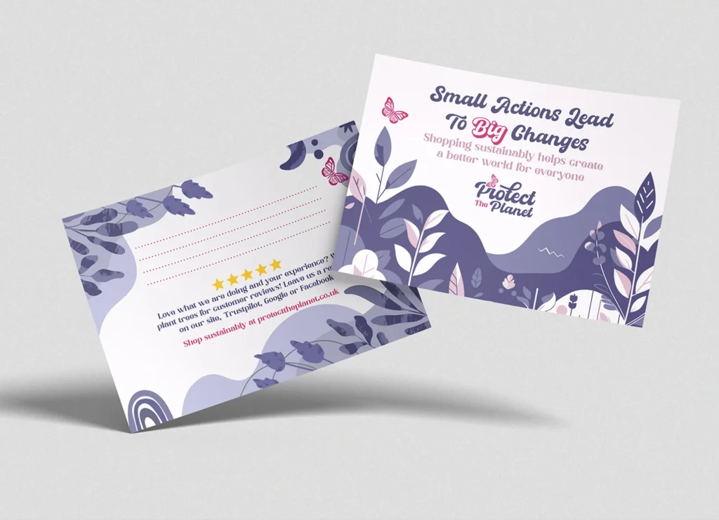
Trust Doesn’t Come From Aesthetic. It Comes From Clarity.
Most eco brands think:
“If it looks natural, people will trust it.”
Wrong.
Consumers in 2026 are sharper than that. They’ve seen greenwashing a hundred times over.
Trust isn’t built through colour palettes.
It’s built through transparency and specificity.
What actually builds credibility:
- Clear sourcing information
- Honest messaging (not fluffy claims)
- Proof over vibe
- Consistency across touchpoints
What doesn’t:
- “100% natural” slapped on everything
- Generic sustainability buzzwords
- Overly soft, apologetic design
You can design the most beautiful eco brand in the world
but if it feels vague, it feels fake.
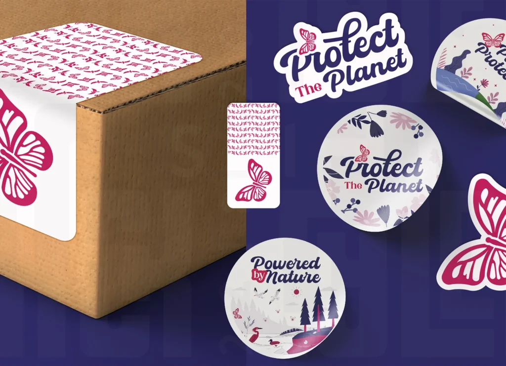
Bold Doesn’t Mean Dishonest, It Means Memorable
Here’s where most brands hesitate:
They think standing out means sacrificing trust.
It doesn’t.
It means owning a point of view.
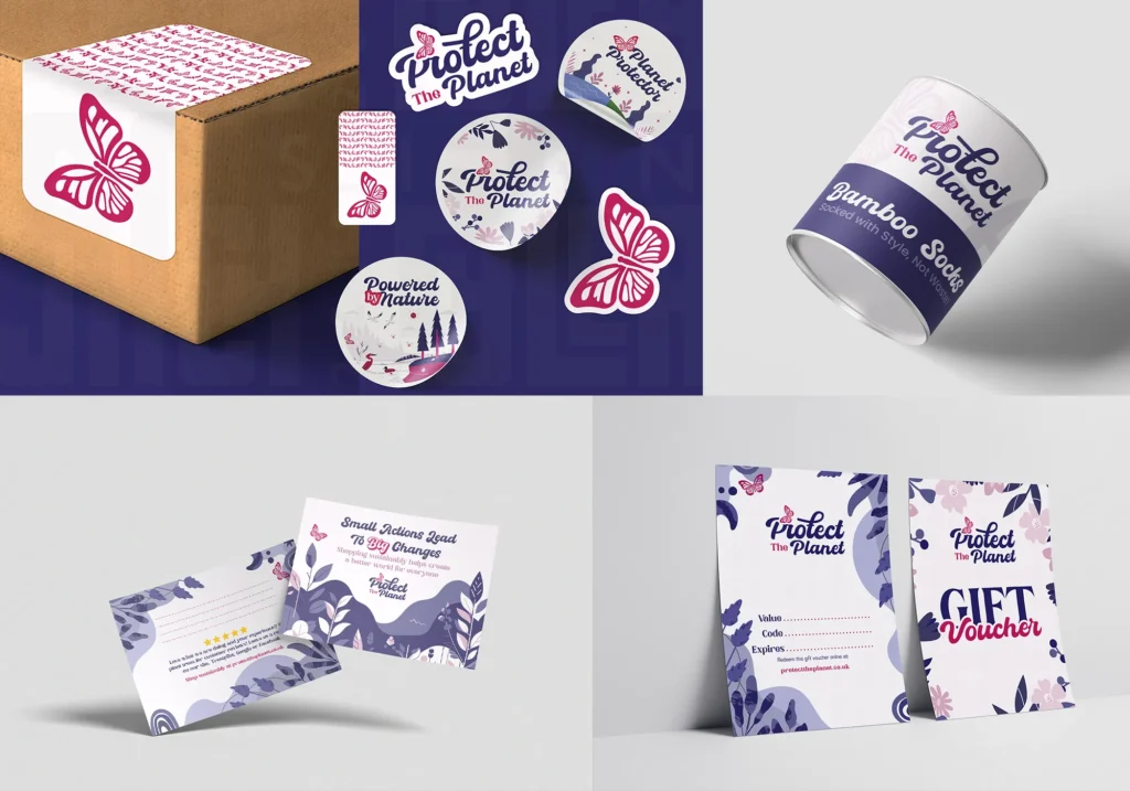
Some of the most effective eco brands right now are:
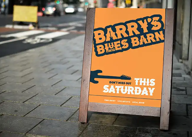
- Using unexpected colours
- Leaning into strong typography
- Creating high-contrast packaging
- Breaking away from “natural = muted”
And guess what?
They’re more memorable and still trusted.
Why it works:
Because the honesty is in the message, not the shade of green.
If your entire brand identity can be replaced with another eco brand’s and nobody notices…
you’ve already lost.
Your Brand Should Reflect Your Philosophy, Not the Trend
Here’s the shift that separates standout brands:
They don’t start with “what looks eco?”
They start with:
“What do we actually believe and how does that look visually?”
Examples of different directions:
- A zero-waste brand could feel raw, industrial, almost brutal
- A regenerative farming brand could feel earthy but structured and confident
- A tech-driven sustainability brand could feel sharp, modern, almost futuristic
Same category. Completely different expressions.
What most brands do:
Copy the aesthetic instead of defining the philosophy.
If your brand isn’t rooted in something real,
you’ll default to whatever’s trending.
And trends don’t build loyalty.
Recognisability > Relatability
This is where people get it wrong.
They aim to be relatable.
But in saturated markets, recognisable wins.
You don’t need everyone to “get it.”
You need the right people to remember it.
That means:
- Strong visual anchors (colour, type, form)
- Repetition across every touchpoint
- Confidence in your identity
Blending in might feel safe in the eco space—
but it’s the fastest way to be ignored.
So How Do You Actually Stand Out Without Losing Trust?
Strip it back to this:
- Say something real no vague claims
- Design from your values, not the category trend
- Use contrast and boldness intentionally
- Build a system, not just a “nice look”
- Be consistent enough to become recognisable
That’s it.
Not more leaves.
Not softer colours.
Not another recycled kraft box with tiny black text.
If This Connects to You
If you’re building an eco brand right now, you’re in one of the most crowded visual spaces there is.
Which means average design doesn’t just underperform, it disappears.
Through Jack Tyler Design, I work with brands that actually stand for something and build identities that reflect that without falling into the “beige eco trap.”
Because sustainability shouldn’t look like everyone else.
It should look like you actually mean it.