
How Adventure Brands Build Identity That Feels Real
Not Corporate

Freelance Graphic Designer, UK
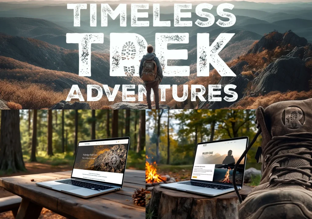
Most “adventure brands” don’t feel adventurous.
They feel like corporate marketing teams pretending to be adventurous.
Stock mountain photos.
Safe slogans.
Over-polished visuals.
It looks right on paper…
but it doesn’t feel real.
And in a category built on authenticity, that’s a death sentence.
Because the people you’re trying to attract?
They can smell fake from a mile away.
01. Tone, Stop Sounding Like a Brochure
Here’s where most brands lose it instantly:
They sound like tourism boards.
“Explore the great outdoors”
“Reconnect with nature”
“Adventure awaits”
That’s not a brand voice.
That’s background noise.
Real adventure brands sound:
- Direct
- Grounded
- Slightly rough around the edges
- Like someone who’s actually been there
What works:
- Short, punchy language
- Specific experiences (not vague inspiration)
- A clear point of view
What kills authenticity:
- Overly polished copy
- Generic inspirational lines
- Trying to sound “epic” instead of real
Opinion:
If your tone sounds like it was written in a warm office…
it doesn’t belong in the outdoors.
02. Imagery: Real Always Beats Perfect
This is where brands either build trust… or lose it instantly.
Most go for:
- Perfect lighting
- Perfect composition
- Perfect models
And it looks like an advert.
Real adventure imagery feels:
- Candid
- Unpredictable
- Slightly imperfect
- In the moment
What works:
- Action shots over posed shots
- Weather, dirt, movement
- Real people, not “models pretending”
What doesn’t:
- Over-edited, glossy visuals
- Obvious stock photography
- Anything that feels staged
Opinion:
If your photos look too perfect…
they’re probably not believable.
And if they’re not believable, they don’t build trust.
03. Typography: Structure Without Killing the Edge
Typography is where a lot of brands accidentally go corporate.
They either:
- Go too clean (tech startup vibes)
- Or too “rustic” (fake vintage overload)
Both miss the mark.
The sweet spot:
- Strong, functional type
- Slight edge or character
- Built for readability in real environments
What works:
- Bold sans-serif with personality
- Limited type system (not 5 random fonts)
- Typography that supports, not dominates
What kills it:
- Overly decorative “outdoor” fonts
- Trying too hard to look rugged
- Inconsistent type usage
You don’t need a “mountain font” to feel like an outdoor brand.
You need discipline and intent.
04. Storytelling: Show the Journey, Not Just the Highlight
Most brands only show the peak.
The summit. The view. The perfect moment.
But that’s not what people connect with.
Real adventure includes:
- The struggle
- The mistakes
- The unpredictable moments
What works:
- Behind-the-scenes content
- Honest storytelling
- Showing the full experience, not just the outcome
What brands get wrong:
- Only posting “hero shots”
- Ignoring the process
- Trying to look flawless
Nobody trusts a brand that only shows the highlight reel.
Because real adventure is messy.
And that’s the part people actually relate to.
05. The Big Mistake: Looking the Part Instead of Living It
This is the root of it all.
Most brands try to look like adventure brands.
Few actually build identities from real experience.
And that difference shows up everywhere:
- In the tone
- In the visuals
- In the details
Real brands:
- Document what they do
- Build from lived experience
- Let identity emerge naturally
Fake brands:
- Copy the aesthetic
- Follow trends
- Try to manufacture authenticity
You can’t fake this category.
You either live it…
or you’re pretending.
And people can tell.
So How Do You Build an Adventure Brand That Feels Real?
Lock into this:
- Speak like a human, not a campaign
- Use imagery that feels lived-in, not staged
- Choose typography that’s strong and functional
- Tell full stories, not just polished moments
- Build from experience, not aesthetics
Do that, and your brand stops looking like everyone else.
It starts feeling like something people trust.
Where This Connects to You
Adventure brands don’t win by looking the best.
They win by feeling the most real.
Through Jack Tyler Design, I work with outdoor and lifestyle brands to build identities rooted in authenticity not trends so they actually connect with the people they’re trying to reach.
Because in this space,
real always beats perfect.