
From Stall to Standout

Branding That Makes Street Food Queues Longer
How thoughtful design, bold visuals and a clear brand story turn everyday street food into a must-try experience people remember.

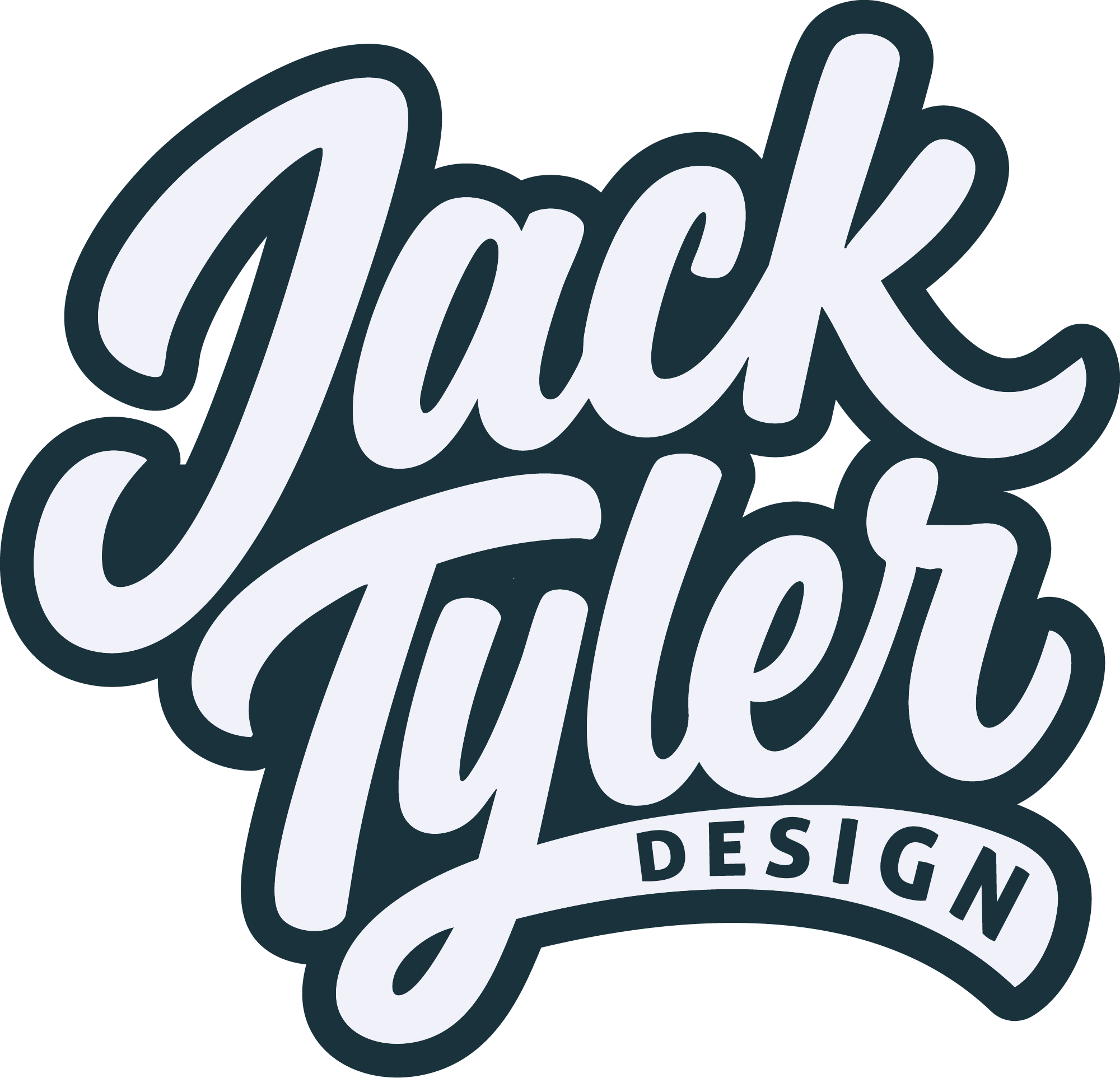
By Jack Tyler
Freelance Graphic Designer, UK
Here’s the truth most food vendors don’t want to hear:
If your queue is short, it’s not just your food. It’s your brand. At a busy market or festival, people aren’t carefully reviewing menus. They’re walking, scanning, deciding in seconds. You’re not competing on taste first. You’re competing on attention, clarity, and trust at a distance. And most stalls fail that test instantly. Let’s break down how the ones with constant queues actually do it.
1.
Signage
If They Can’t Read It in 3 Seconds, You’re Invisible
Walk through any food market and you’ll see the same mistake everywhere: Tiny logos, Script fonts, Over-designed chalkboards. Looks “nice” up close. Completely useless from 10 metres away. Your sign has one job: get someone to stop walking. THAT’S IT.
What actually works
- Massive, bold typography
- High contrast (black/white > pastel mush)
- One clear message (not your entire menu)
- Strong shape or icon people recognise instantly
What kills footfall
- Fancy handwritten fonts no one can read
- Too many colours fighting each other
- Trying to be “quirky” instead of clear
My Opinion
If someone has to step closer to understand what you sell… they won’t. They’ll go to the stall next to you that shouts louder visually.
2.
Menus
Decision Speed = Queue Length
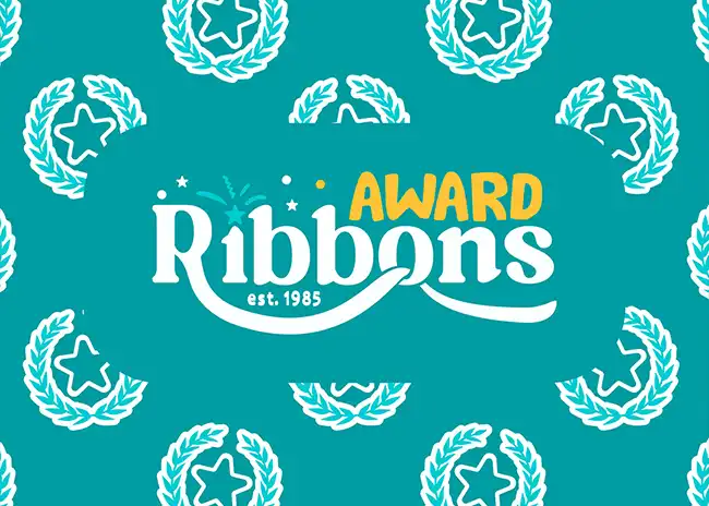
Here’s where most vendors sabotage themselves: Big queue energy… killed by slow decisions. People reach the front and suddenly freeze. Why? Because your menu is a wall of text. A good menu doesn’t show everything, it removes friction.
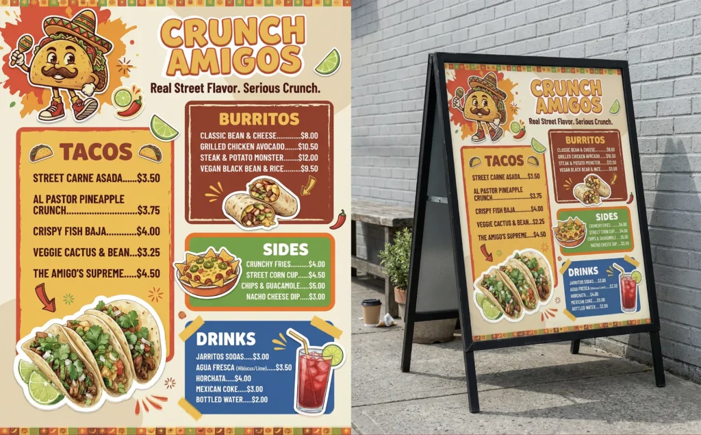
Credit – Farooksha On Behance
What actually works
- 5–8 core items max
- Clear hierarchy (what’s the hero item?)
- Pricing visible instantly
- Descriptions stripped down to essentials
What kills footfall
- 20-item menus
- Long descriptions nobody reads
- Hidden prices (instant trust killer)
My Opinion
If your menu needs explaining, it’s broken. The best stalls feel effortless to order from. That speed? It builds momentum. Momentum builds queues. And queues sell more than any marketing ever will.
3.
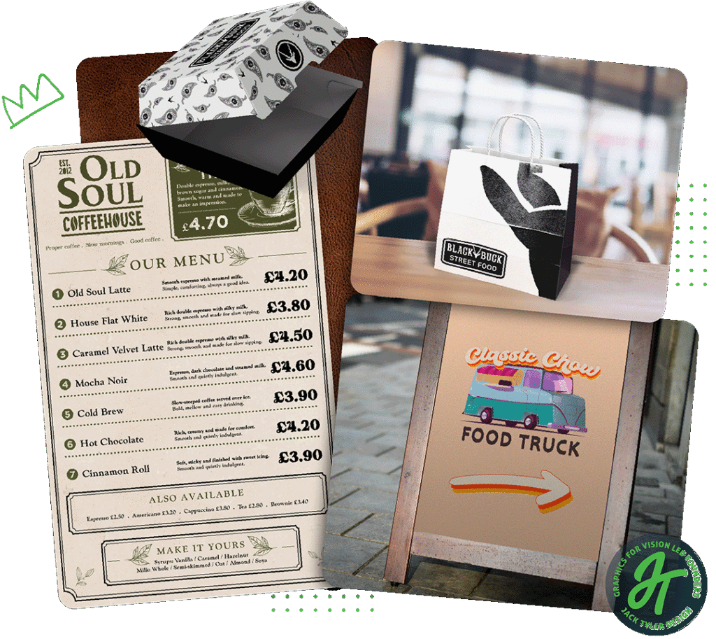
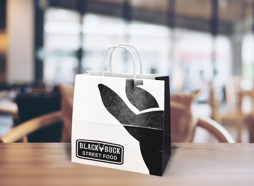
Packaging
Your Free Marketing Engine
(That Most People Waste)
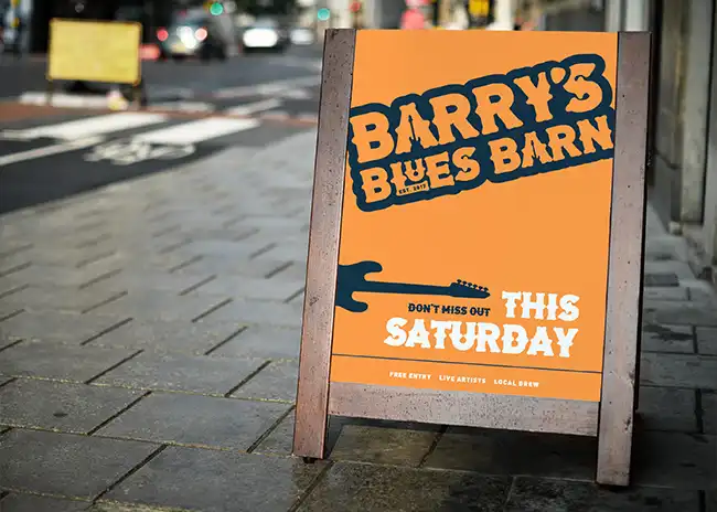
Look around any busy event. People walk away with your food… and your branding disappears. Plain boxes. Generic napkins. Nothing memorable. You’ve just lost your easiest exposure. Packaging should turn every customer into a walking advert.
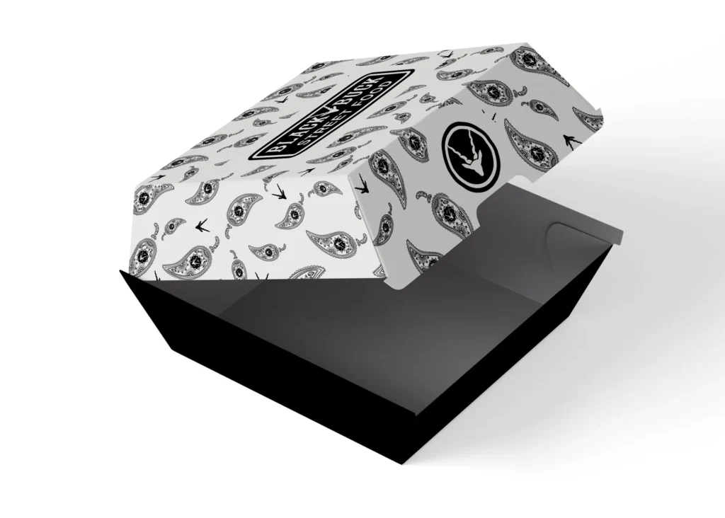
Credit – Jack Tyler
What actually works
- Bold, simple branding (not cluttered)
- Recognisable colours or patterns
- Logos that read instantly in a crowd
- Designed for photos (yes, Instagram still matters)
What Most Vendors Do
- Buy cheapest generic packaging
- Slap a tiny sticker on it
- Call it a day
My Opinion
If your packaging isn’t being photographed, you’re leaving attention on the table. And attention is the real currency at events.
4.
Recognisable Visuals
You Should Be Spottable From Across the Field
This is where standout brands separate themselves completely. They don’t just have a logo. They have a presence. You can spot them from across the venue without reading anything.
Credit – Jack Tyler
What creates that:
- Consistent colour dominance (own a colour)
- Repeating visual elements (patterns, shapes)
- Matching signage, uniforms, packaging
- Strong silhouette (how the stall looks as a whole)
What kills it:
- Mismatched elements
- Random colours every event
- “We’ll just use what we’ve got” setups
My Opinion
If your stall disappears into the background… you’re not competing. You’re just existing. And existing doesn’t create queues.
5.
The Hard Truth
People Queue Where It Feels Popular
This is the part nobody talks about. People don’t always pick the best food. They pick:
- The busiest stall
- The most confident brand
- The one that looks like it knows what it’s doing
Branding drives that perception.
A strong visual presence does three things instantly:
- Signals quality
- Builds trust
- Creates curiosity
That’s what gets someone to stop. And once a few people stop…
the queue starts building itself.
So What Should You Do Next?
If your stall isn’t pulling the attention it should:
- Strip your signage back and make it louder
- Cut your menu in half
- Upgrade your packaging to be seen, not just used
- Build a consistent visual identity across everything
Because right now, most vendors aren’t losing on food. They’re losing on visibility and clarity.
Looking for outstanding branding for your Street food brand? Drop me a message to start your project today!